If the last post made you think that I’ve joined the X-Files blogscene I have to disappoint you. I’ll stick to the visual arts. Today I bring you a Photoshop tutorial based on a movie poster mock-up I made back in Canterbury.
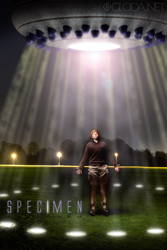
Hit the jump for a walkthrough of the shoot and a step-by-step explanation of how I used Adobe’s Photoshop to turn my friend Ollie into a Specimen.
The tutorial should be pretty comprehensive but if you find that I glossed over a step let me know in the comments. You can also download the source images and work along if you like, the original files are published below under a Creative Commons Attribution-Non-Commercial 3.0 Luxembourg Licence.
Specimen by Gilles Glod is licensed under a
Creative Commons Attribution-Non-Commercial
3.0 Luxembourg License. Based on a work at gloda.net.
The shoot
I wanted the picture to have an outdoor element, suggesting that the aliens just flew around and picked the first suitable candidate. We shot this on the St Stephen’s Green in Canterbury. I put the camera (a Canon 40D with the Canon EF-S 17-55 2.8 IS USM) on a tripod. There was no third person to help out as voice-activated boom, so the camera would have to be triggered remotely.I used a radio tigger from Gadget Infinity for that. The camera was set to manual focus on the spot where Ollie stood. I made him hold a bike light and used LiveView to get the focus right.
The light source I’m using is a 28″ Westcott Apollo Softbox that I had received that same week. In this situation it was the best light modifier I could ask for. A bare flash would have resulted in too small a lightsource and hard shadows, whereas the ‘tractor’ beam of a spaceship would be larger and cast soft shadows. An umbrella, whether shoot-through or reflective, would have resulted in a visible light source within the frame, causing problems with flare and reducing contrast in the rest of the frame. The softbox has all sides except the front covered in black material, so spill is not much of a problem.
I had to hold it as straight above Ollie as possible to simulate the kind of light that would be emitted by the beam of a spaceship flying above him. Inside the softbox there is a Canon 430EX Speedlight in ETTL slave mode. It can be triggered by the optical signal sent out by a master flash, in this case a 580EX. ETTL allows me to change the slave’s power settings from the master without taking the slave out of the softbox. The downside of this system is that it relies on line of sight. I could not leave the master on the camera, it was too far away and the signal did not get through to the slave. Instead I had to hold the master in my right hand and trigger it by pushing the test button.
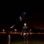
You can see from the way I stand in the original photo that it’s not a very comfortable way of doing things. It also means that the light emitted by the master will be visible in the shot. Since I knew that I’d have to remove myself from the final image anyway that was not a big problem though. In order to be able to choose exactly what will be part of the final image and what won’t, I took a second photo at the end with nobody in it, and exposed for 30″ and ISO 400 at f4 – over four stops brighter than the background in the main exposure, which was 6″ with ISO100 at f4.
I made Oliver jump up for the picture and triggered the flash when he was airborne so as to give the impression that he was being lifted off his feet. If you look closely you can see that the ambient light painted his feet for the time during which he wasn’t in the air.
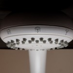
So much for the scene, the spaceship is just a simple showerhead. Nothing exciting about how that photo was taken.
Post Processing
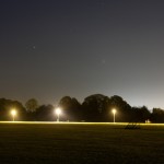
Right, time to switch on Photoshop! By the way the students and teachers among you can get the Student Edition for around £100 which I think is a bargain. So here goes. Open the picture with Ollie and the picture with just the background. On the background image I first did some cleaning up. I cloned out a star, a goal and some people in the background, all using the Clone Stamp tool.
When you’re done, switch to Ollie’s picture. Use CTRL-A (or Cmd-A on a Mac) then CTRL-C to copy the whole image. Switch to the other image and hit CTRL-V to paste it as a new layer. They will not match up perfectly because the tripod moved a bit. Select both layers in the layers palette (hit F7 if you can’t see it) by clicking first one, then CTRL-clicking the second layer. Now go to Edit->Auto Align Layers and choose the automatic method.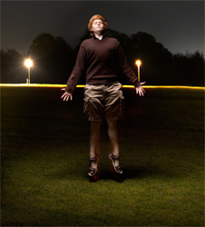
The two images are now nicely lined up. Select the upper layer with Ollie in it and add a black layer mask to it (Layer->Layer Mask->Hide all). The upper layer has now become invisible. Click on the black box next to the image thumbnail in the layer palette to select it. Now use a soft white brush (B) to paint Ollie back into the picture. If you make a mistake, hit X to swap white and black and paint the black areas back in. When you’re done you should have something like this picture:
What’s important is that you get rid of me holding the lightstand and that the grass still gradually changes from bright to dark. The next small step is to add some colour to the grass. Click on the upper layer, then add a HSL layer (Layers->New adjustment layer->Hue/Saturation…). Change the hue to +20. Notice how the grass turns green. But now Ollie has turned green too.
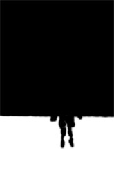
Click on the mask of the adjustment layer (the black box) and use a black brush to paint in those areas where Ollie stands to get his colours back to normal. Do the same for the sky. If you ALT-click on the mask you can see exactly where you’ve painted and where not. Here’s what my mask looks like:
That’s it for the background. Now let’s greet our intergalactic visitors. Open the showerhead photo, then copy and paste it as a new layer onto the other image. Use the move tool (V) to get it’s centre right above Ollie’s head. If you think it’s too big or small, use Free Transfrom to adjust its size.
When you’re done, make sure the showerhead layer is selected and press CTLR-G to place that layer inside a group. We’ll use the group feature so as to be able to affect everything that happens inside that group in a collective way.
The first thing we’ll do to that group is to add a layer mask. Select the group and go to Layer->Layer Mask->Reveal all. Alternatively you can click on the mask icon in the layer palette.
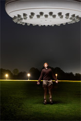
Now we have to isolate the showerhead from the background. I did this by selecting bits I wanted to hide with the polygonal lasso tool and then filling those areas with black. You can also just use the brush tool to paint the areas you want to hide black. Your result should look like this:
When you’re done it’s time to make the showerhead a bit darker. Click on the layer (not the group) with the showerhead and add a Curve adjustment layer. This is what my curve looks like:
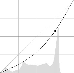
Now we’ll turn the nobs blue to add a splash of colour. You can pick any colour you like of course, or just leave them grey. Add a Hue Saturation adjustment layer like you did for the grass. Check the ‘Colorize’ box in the lower right hand corner and set the Hue to 247 and the Saturation to 36. Hit OK. Then click on that layer’s mask and hit CTRL-I to invert it (to make it black). Now we have to get the nobs to show up in that mask again. We could paint them in with the brush tool. But I’m lazy and prefer to let Ps do the job for me.
Make sure you have the showerhead layer selected. Now go to Select->Colour range. In the preview window you see a black and white image. That’s what our selection is going to look like. Click on one of the nobs in that window to select the nobs’ shade of grey. Shift-Click on some more nobs to pick up the different shades that are visible on the nobs. Then play around with the fuzzyness until you have selected most of the nobs without selecting too much of the rest of the shower head. Here’s what I got:
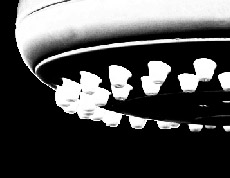
You’ll notice that some of the top of the shower head also got selected. That’s ok, we’ll take care of it later. Click ok. You’ll see marching ants around the areas that have been selected. Now select the Hue Saturation adjustment layer’s mask from the layer palette. Make sure white is your foregrond colour and hit Alt-Backspace to fill the selected areas with white. All the areas that are white in the mask are blueish in the picture now. Alt-click on the mask to see it better and then use the brush tool to paint those areas black that are not nobs. Your result should look more or less like this image on the left.
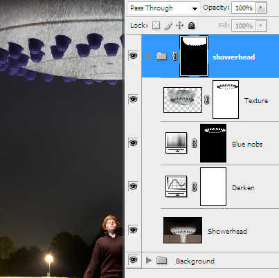
Alt-Click the mask again to return to the normal view. Our next step will give the showerhead some texture so that it won’t look like plastic so much anymore. You’ll need a texture for this. Maybe you have one you like on your hard disc already, if not, visit one of the websites from the resource group in my link section. I used a marble surface. Copy and paste the picture into the group you created earlier and make sure it’s the topmost layer. Since the group already has a layer mask you don’t need to worry about the texture covering bits of the sky, and since the layer is above the adjustment layers it won’t be affected by them. Once the texure is in position change its blend mode to something to your liking. Overlay and Multiply usually yield the best results for this kind of thing. I used overlay and then reduced the opacity to 65%. If you find that your texture affects the nobs and you don’t want just mask it: Alt-drag the mask from the Hue Saturation layer on to the texture layer. This is going to duplicate the mask and apply it to the texture. The mask is the wrong way around now though, revealing the texture only in the nob area instead of overywhere else. Just hit CTRL-I to invert the mask. Tadaa. This is what your layer palette should pretty much look like now:
The next steps are all concerned with the lighting. First let’s have a look at the outer spotlights. Use the pen tool to draw 20px wide white lines through the nobs that you want the beam to shine through all the way down to the edge of the canvas. Repeat for every beam. I first did this with only that half of spotlights that’s closest to the viewer so that I could affect the front and rear beams separately. When you’ve made all your strokes your picture will look like this:
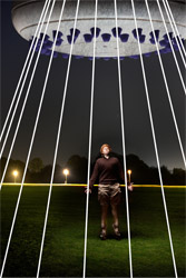
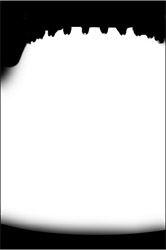
Put all the strokes into a group, then duplicate that group by rightclicking on it and selecting Duplicate Group. Merge the copy by rightclicking on that new group and selecting Merge group. Then turn the original invisible by clicking the eye icon of that group. You can delete it if you know you won’t need it anymore later on. All the strokes are now combined in one single raster layer. But they look too hard to be light beams. So well add some blur to them. Let’s start with some radial blur: Filter->Blur->Radial Blur. Set the method to spin, place the center of the spin as high up as possible and slightly to the right, aligned with the centre of the spaceship. Reduce the amount to 1. The strokes will become wider and look like they become broader as they go further away from the nobs. Their edges are still a bit hard so we’ll also apply a Gaussian Blur (from the same menu) with an amount of 20. Put this layer in a new group and add a layer mask to that group. Mask the light streaks that are above the nobs and mask them where you think they should end as they hit the grass in a semicircle. Here’s what my mask looks like:
You’ll notice that in the final picture, the beams aren’t very uniform. Let’s do that now. Select the layer mask of the beam layer and go to Filters->Render->Clouds. Cool, now they’re more like smoke. But the filter has deleted the mask we’ve just made! We only wanted it to darken the white areas and not affect the rest. To do that, go to Edit->Fade Clouds. [Notice that this only works if applying the filter is actually the last thing you did.] In this menu we can either reduce the opacity of the ladt filter effect we used, or change it’s blend mode. We’ll just change the blend mode to Darken. If you look at your mask now you’ll notice that your black areas remained untouched and that the white areas have had the cloud filter applied to it.
I also added a bit of colour to my beams. For that I duplicated my beam layer within the group and applied a bit of yellow to it by going to Image->Adjustments->Hue Saturation. Check the colorize box and pick a hue and saturation that you like, I went for 60 and 100. Also reduce the lightness to about -30 or you won’t see any changes. Click ok. Now the entire beam is coloured. I wanted only the upper area to be coloured with the colour fading to white as the light gets further away. To do that, add a layer mask to the coloured layer. Then select the Gradient Tool (G) and select a black-to-white gradient from the top and select Gradient Fill.
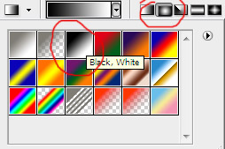
Check the Reverse box (next to opacity) in the tool options. With the gradient tool, drag a line from the top of the spaceship down to beneath Ollie’s feet. Now the beams are yellow at the top and become whiter as they go down.
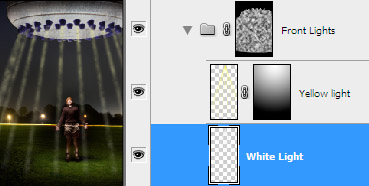
Repeat all the steps we made for the front lights again for the lights that you want at the back.
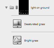
Next we’ll make some bright spots where the beams hit the grass. Create a Curves adjustment layer and make a curve like this:
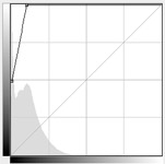
Hit CTRL-G to add that Curve layer into a group and add a black layer mask to that group which completely hides the effects of the curve layer. Then use the ellipse tool to add white… well ellipses to the ground where the light hits it. When you’re happy with that you’ll most likely notice that the grass now has a yellowish tint. Just add a Hue Saturation adjustment layer into the masked group we just made. Drag the Saturation slider all the way down. If you think that the edges of your ellipses are too hard just run a slight Gaussian Blur filter on the group’s mask.
So much for the outer beams. Now it’s time to switch on the tractor beam which is going to pull Ollie up into the ship.
Create a new layer and paint the area that the beam would light up. Make sure it’s wider at the bottom than the top. Add a mask to that layer. In the mask, with a soft brush erase the bottom of the light cone to simulate the light’s fall off. I didn’t want the beam to obscure the face too much so I masked that area too. Then I used a gray brush to reduce the strength of the beam in those areas where the beam would be stopped in it’s way, that is along the chest and below the hands.
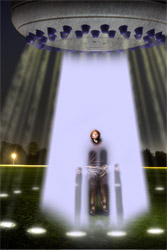
Use CTRL-G to put this layer and it’s mask into a group. Add a mask to the group and use the same technique as before to add smoke to the mask. I also added a radial zoom blur to the mask with the smoke effect. (Filter,Blur,Radial Blur,Zoom. The origin is where the light comes from.) Select the layer with the light cone, change it’s blend mode to screen and reduce it’s opacity to around 20%.
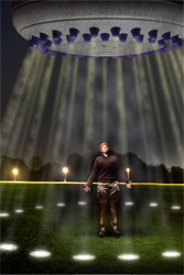
Now let’s add some light effects to the UFO to reflect the effects the tractor beam would have on it.
Create a new empty layer. Using the circular marquee tool draw an ellipse where you want the opening to be and fill your selection with white. Hit CTRL-D to deselect.
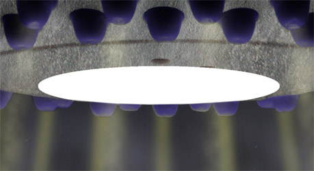
Double click the thumbnail of the layer with the ellipse to open Layer Styles. Click on Bevel and Emboss. Play around with the Depth and Size settings to add a 3D effect to our opening. I used a Depth of 600 and a Size of 20.
Now click on outer glow. Change the colour to white. Play around with the Spread and Size options to get a nice glow around the opening. Leave the Spread quite low though. I used 5% and 120% here. When you’re done, click OK to accept the layer styles.
The trouble is that now the outer glow affects not only the ship at the top of the ellipse but also the bottom, where due to perspective it shouldn’t be all that visible. In order to mask the outer glow you created with layer styles, right-click on ‘Effects’ below the layer in the Layer Palette and select ‘Create Layers’ near the bottom of the list of options. Now you can edit the effects individually. Select the outer glow layer, add a mask to it and mask the area below the ellipse where there should not be a glow.
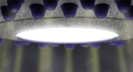
Now we’ll add a lens flare. Create a new layer and fill it with black. Change it’s blend mode to screen. Now go to Filter,Render,Lens Flare…
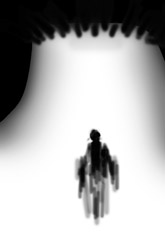
I chose the 50-300 zoom effect, if you refer one of the others, go for it. Put the flare location right in the middle of the frame. Adjust the brightness to your taste and hit OK. Now use the Move tool to position the center of the flare over the opening of your ship. Then add a layer mask to the flare and mask the effect over the areas where you don’t want it. I masked parts of Ollie, as well as the areas outside of the outer beams. It’s also important to mask the nobs that are on the front of the ship and the areas where an actual light source wouldn’t reach, since the nobs cast shadows. Here’s what my mask looks like:
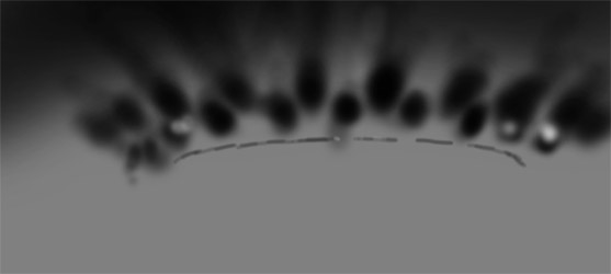
With the lens flare in place it’s time to get some nice shadows on that ship. Create a new layer and fill it with 50% grey (#808080). Change it’s blend mode to soft light. What’s going to happen now is very much like dodging and burning, except it’s non-destructive and can’t use the Highlight-Midtone-Shadows distinction. Use a soft black brush to paint shadows into your picture and a white brush to add highlights. The side of the nobs facing the opening should be brightened a bit, the other side darkened, and since the cones cast a shadow, darken the area around them too. The same goes for the upper part of the ship. Here’s what my layer looked like in the end (you can see what yours looks like by changing the blend mode back to Normal):
That’s it for the base picture! The last step will be to add some text. I used the font AlienLeage which I downloaded from Dafont.com, here: http://www.dafont.com/alien-league.font.
Write the text in black then right-click on it’s layer and convert it to raster. Double-click on the layer thumbnail to choose some Layer Styles. Click on Drop Shadow and play around to add a bit of 3D to the text. I chose a distance of 7, a Spread of 0 and a size of 8. Check the Global light box and set the angle to 90°. You can leave the other settings alone.
Now go to Outer Glow. I used a purple colour with an opacity of 18%. In the Elements box set the Technique to Softer, the Spread to 4% and the size to 20px. YMMV. Then click on Color Overlay and add a deep purple at 60% or so.
Now add a mask to your layer and hide the ‘I’. Create a new layer with just the I which you have to place where the other I would have been. we’ll again add some layer styles as before: Go to Outer Glow, set the Opacity to 100%, noise to 0, the colour to white, Spread to 3, Size to 46. Season to taste. Hit OK.

Now duplicate the first text layer you created. Delete the mask and drag it to the top in the layers palette. Use CTRL-T to start the transform tool. Drag the upper middle ‘hande’ down to turn the text upside down and CTRL-drag the same handle let to skew the text. You should end up with a shadow that makes logical sense if the text is hit by the tractor beam. When your’e done, add a bit of Gaussian Blur to take the sharpness off the shadow and play around with the opacity if you like.
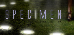
There you go, I hope you enjoyed this tutorial. It turned out a bit lengthier than I expected but pretty much everything should be explained. If you still have any questions, leave a comment!
Leave a Reply